Your GreenSight drone is equipped with our patented self calibrating thermal imager, an amazing tool capable of capturing the information needed to deliver accurate surface temperature maps of your property. These maps are viewable in “thermal” tab in your GreenSight Portal.
During each flight over your property, the thermal camera in your GreenSight drone captures, on average, just over 900 images per flight. The raw images from the thermal camera are grayscale, “black and white” images that we stitch together to create one continuous surface temperature map of your property. We use some special techniques to colorize the data and make it easier to interpret.
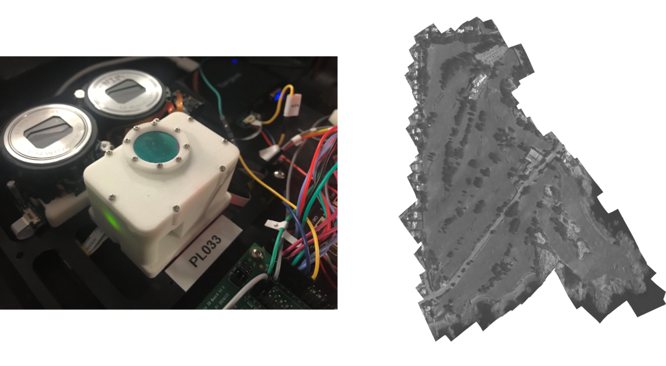
Each stitched map is comprised of grayscale pixels that have a value ranging from 0 to 255, with 0 being completely black and 255 being completely white. Pixel values closer to 0 represent areas on the map that are cooler, while pixel values closer to 255 represent areas that are hotter. Plugging these values into an equation allows us to determine the exact temperature for the area that each pixel on the map represents.

The idea of an accurate surface temperature map sounds wonderful and useful. However, the grayscale maps that are generated from the raw thermal camera imagery are difficult to look at. It is difficult for the human eye to discern differences in grayscale maps and images. Full-color maps do a much better job of accentuating minute differences and details that are nearly impossible to see in grayscale. To further compound the issue, the range of pixel values in a typical surface temperature map does not have a wide range of variability. An early morning flight, when dew is still covering the ground, may only produce a range of pixel values that vary by a value of 20 from the coolest areas to the hottest areas.

This narrow range of values is simply due to the fact that surface temperatures tend to be more homogeneous early in the morning and can vary later in the day after the sun has warmed up the surface and burnt off any dew. The sun’s energy is putting the “signal” into the turf as it warms it up, giving our camera a wider range of values to observe. Flying early in the morning generally results in maps that appear to be almost completely monotone and look like a gray blob. Similarly, if you were to fly at night, you would see a nearly flat temperature map!
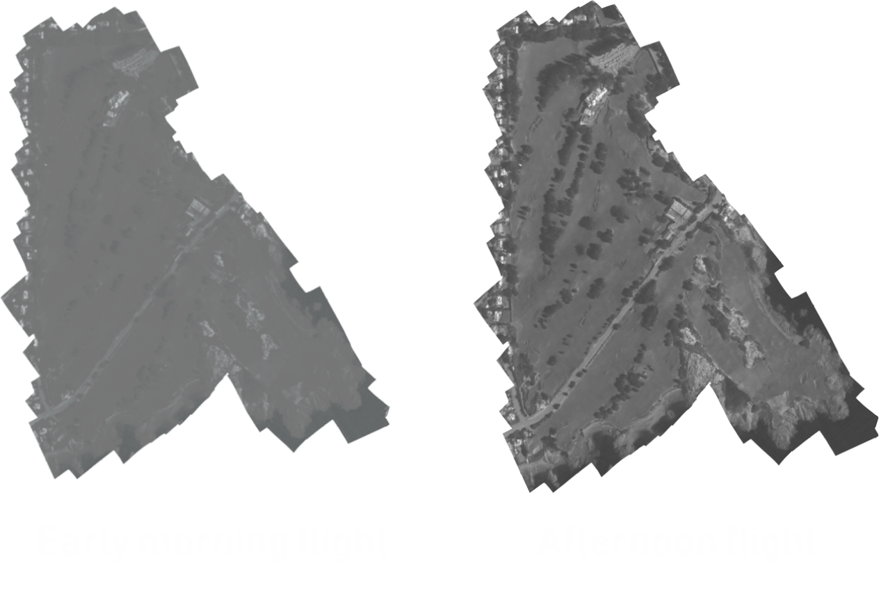
If your goal when looking at your thermal maps is to quickly identify areas of your property that are hotter and cooler than others during times of environmental stress, then flying later in the day provides much better results.
While flying later in the day produces grayscale thermal maps with a higher amount of variability and detail, it doesn’t change the fact that the maps are still grayscale, making it difficult to decipher the valuable information that they contain. In order to better highlight and present this information, we apply a special full-color scale to the grayscale map, effectively replacing each grayscale pixel in the map with a full-color one.
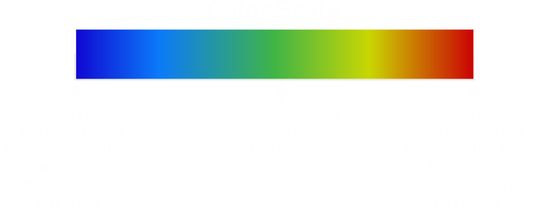
There are a few different methods that can be used to colorize a grayscale map. One is assigning a full-color scale to the grayscale map on an absolute 1:1 ratio. Remember that grayscale pixels range in value from 0-255? If we assign a full-color scale, such as the one illustrated below, to each of these values it would mean that a given color would always represent the same grayscale pixel value and thus the same temperature. For example, dark blue would always represent 0 and dark red would always represent 255.

Employing this absolute replacement method seems to make perfect sense. However, the results are still less than perfect. Again, because pixel values on a typical thermal map don’t vary by large amounts, the range of colors that would be used to replace the grayscale pixels on a 1:1 ratio would be extremely narrow. So instead of having a grayscale map that looks like a gray blob, you would have a full-color map that would look like a blue, green, or red blob. Illustrated below would be the range of colors used to replace the grayscale pixels using the absolute replacement method. Clearly, a much better method of colorization is necessary.

To better identify and display areas of your property that are cooler or hotter than average, we colorize our grayscale thermal maps in a more relative way by finding the average pixel value of all areas of turf and then centering our full-color scale around that value.
To achieve this, first, we feed the visible imagery gathered on the same flight as the thermal imagery into a proprietary Greensight developed artificial intelligence network to isolate areas of greens, tees, fairways, rough, and other turf. Pictured below is an example of the before and after results generated by the artificial intelligence network. Isolated areas are white. Discarded areas are black. This is a critical step in the colorization process because taking pixel values into account of non-turf areas such as cart paths, sand traps, desert scrub, or water can skew the average pixel value towards one end of the spectrum unnecessarily.
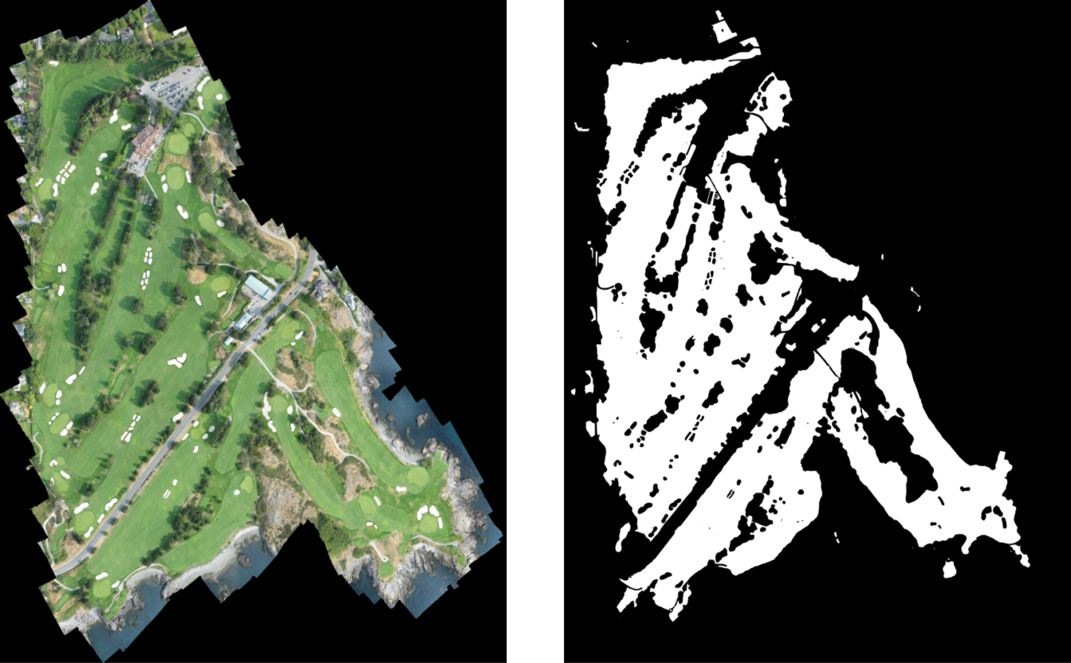
We then cross-reference the exact geo-location of each isolated area in the visible imagery to the same geo-locations on the thermal imagery. The average pixel value of all of the cross-referenced areas in the thermal imagery is then found. Finally, based off our experience in determining the typical range of pixel values in a grayscale thermal map, we stretch the full color scale across grayscale pixel values that are calculated to represent areas that are 3 degrees Celsius cooler than the average temperature of all turf areas, to grayscale pixel values that are calculated to represent areas that are 3 degrees Celsius hotter than the average temperature of all turf areas. The resulting full-color scale is illustrated below.
The end result is a full-color thermal map that clearly displays areas that are cooler or hotter than the average surface temperature of all areas of turf. Pictured below are the original, grayscale thermal map, and the colorized result.
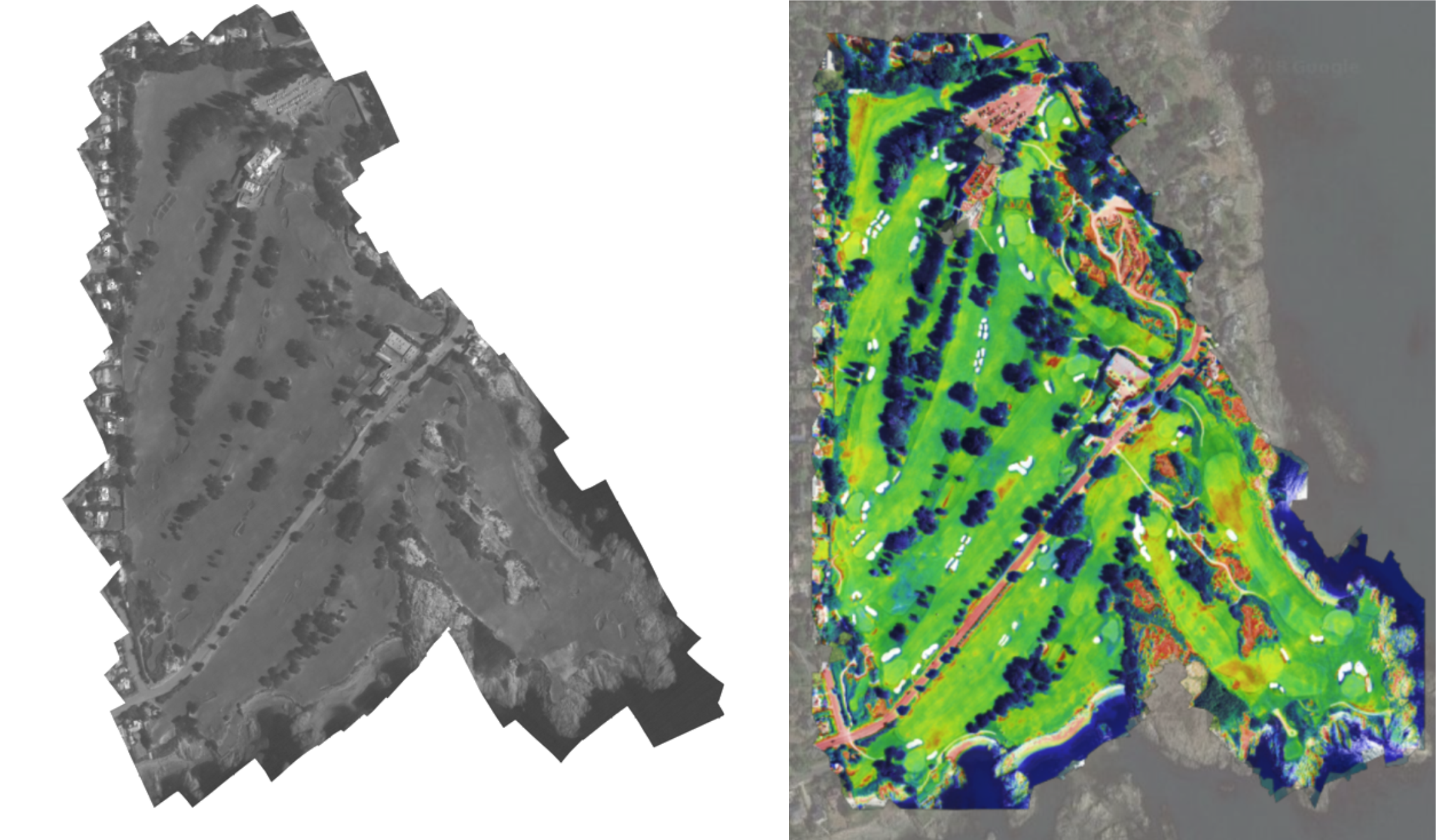
It is important to remember when looking at your thermal maps that the maps are only relative to themselves. The same color green on yesterday’s and today’s thermal map may not represent the same temperature value. The color green on your thermal maps always represents areas of the map that are equal to the average surface temperature of all areas of turf on your property on the day the images were captured in flight.
Also, just because an area on the thermal map is red, it doesn’t necessarily mean that it is under stress. It simply signifies that the area is greater than, or equal to 3 degrees Celsius hotter than the average surface temperature of all areas of turf for the day. On a hot, dry summer day, areas in red that are hotter than average could be of greater significance than on a cool spring day. If you are in an area where irrigation requirements are high, it is very likely that these areas need to be investigated and addressed with additional water application! After you investigate a few with your moisture meter, you’ll learn when water is needed and when other management techniques might be needed.
It is also important to note that thermal maps are not maps of soil moisture content. While the correlation between surface temperature and soil moisture has been shown under certain conditions, they don’t always correlate. Learn to understand what the colors on your thermal map signify for your property under different weather conditions and at different times of the year. Determine what colors mean for you similar to how you determine what moisture meter percentage readings mean for your property at different times of the year. You know your course best, and thermal imaging can help you monitor and understand it even better from the comfort of your office!


